

Killer is Dead: The Case for Aesthetics

Entry posted by solidbatman
1409 views
About a year and a half ago, I completed the Suda51 title, Killer is Dead. I honestly am not sure what happened but I will do my best to sort it out. Despite me not knowing really what was happening, something aside from the mediocre gameplay kept me going. It was the aesthetics. I'm done with that bit now btw.
Spoilers ahead.
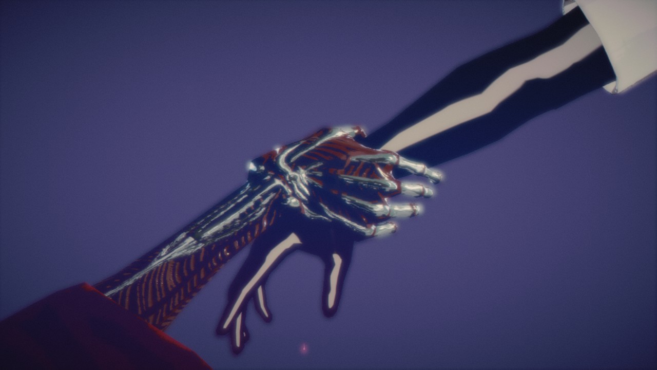
The whole point of this post isn't to discuss the story or the quality of the game Killer is Dead, but rather to examine the art style and how it made me want to complete the game. Killer is Dead is a hack and slash game from the mind of Suda51. Opinions on his ability to craft a good game aside, his art direction tends to be on the more creative side. The art of Killer is Dead is why I set aside my qualms I had for the gameplay and story and found myself continuing to play it to completion. Take David for example...
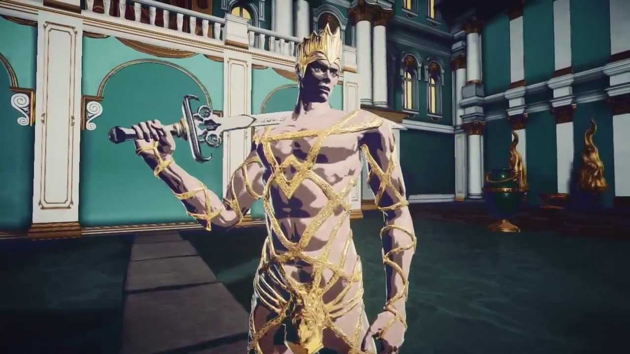
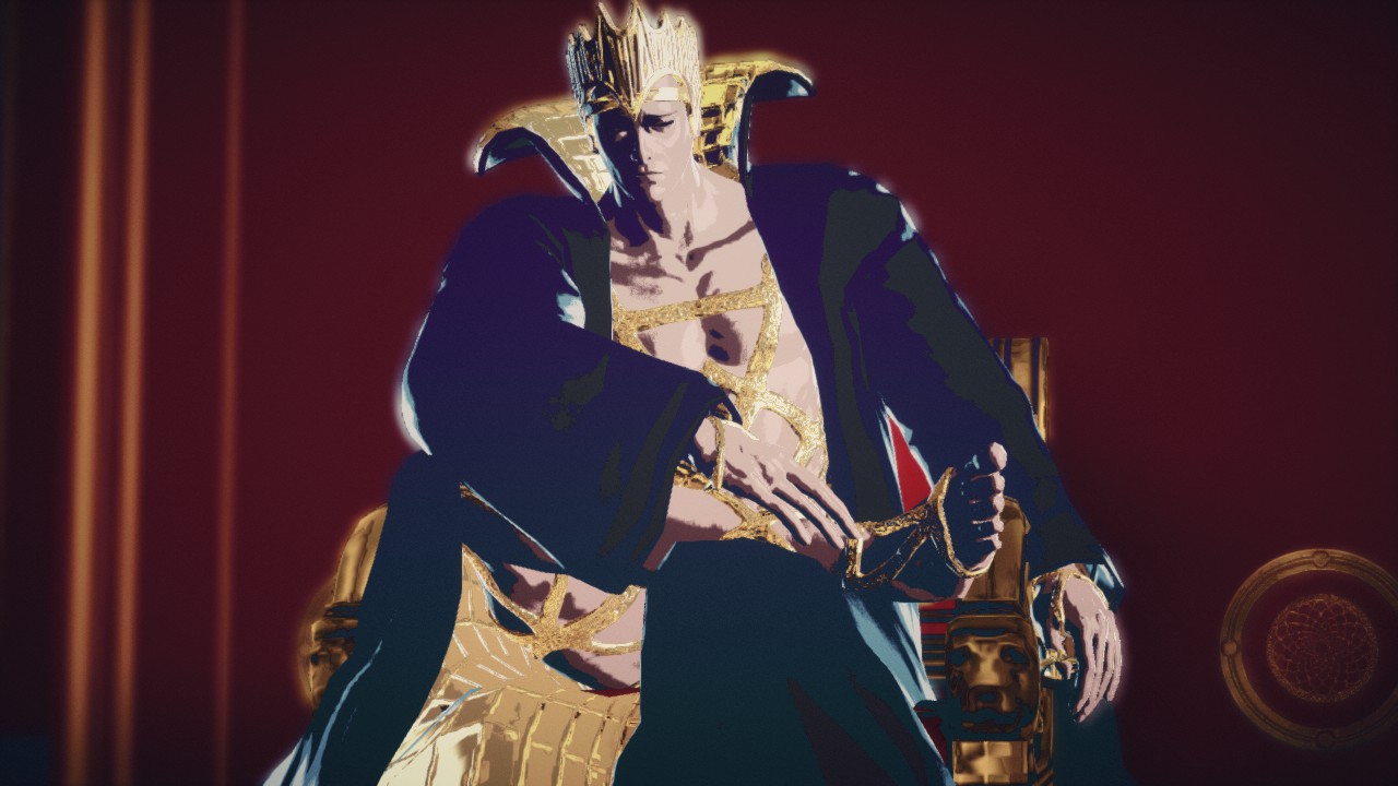
He some sort of king or something living on the dark side of the moon. But what stands out to me isn't his story. It's his god damn gold clothes. When the first major boss of the game looks like this, I cannot help but be intrigued. I honestly remember nothing about David except that the little shit shows up and ruins breakfast at one point in the game while wearing a stupid shit eating grin as shown here.
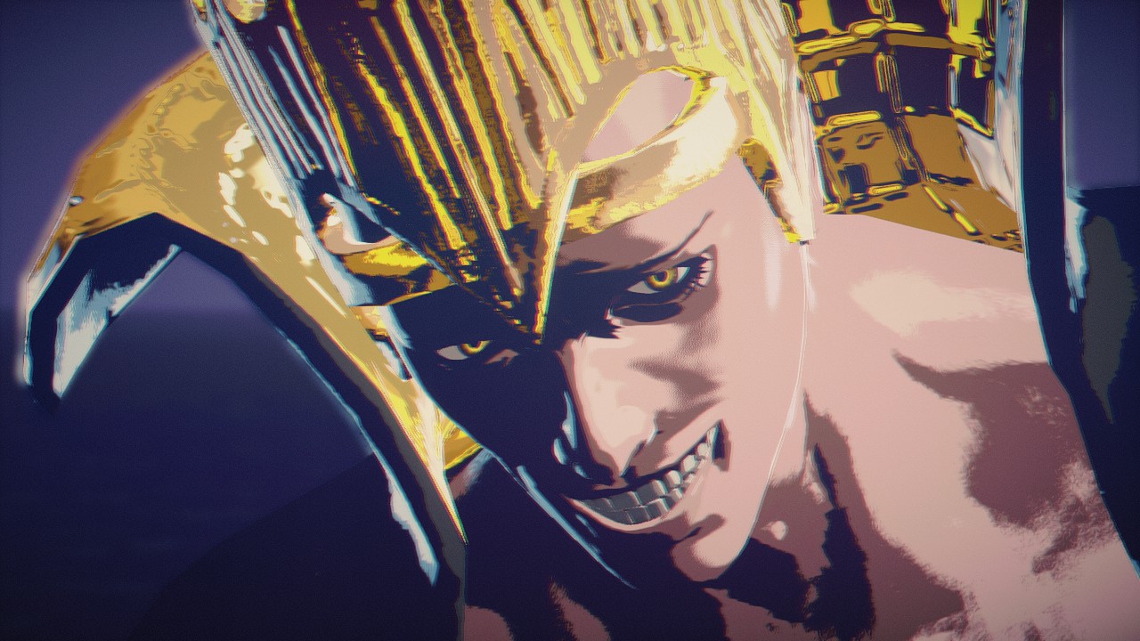
This is a man set on ruining your breakfast. I think he might have been your brother or something but he time traveled and killed your mom at breakfast [citation needed]. But lets take a look at some of the other screenshots from the game.
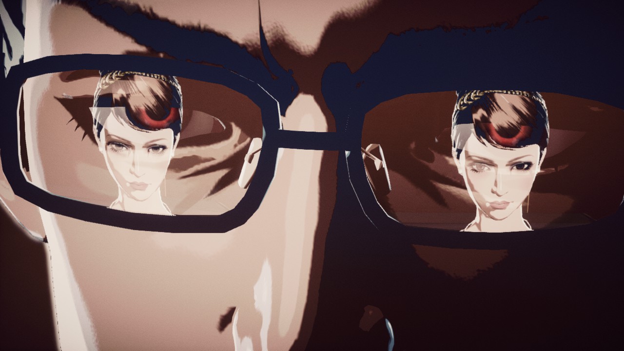
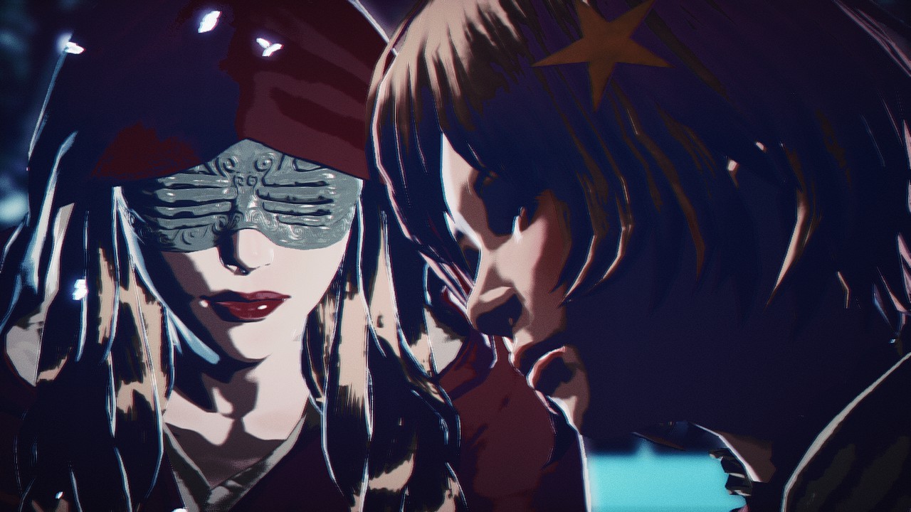
I honestly don't remember what any of these are from in the game, but the actual visuals of the game are what stick with me after all this time. Not the gameplay, or the story, but just the visuals. That leads me to my rambling point that I haven't argued. Graphics can totally be the only thing a game has going for it and that is fine. Killer is Dead is a prime example of this. The gameplay is forgettable, while the story is only memorable because it is driven entirely by the unique art direction of the game. Killer is Dead was entirely worth the time and money I spent on the game for one reason: it was so damn interesting to look at.
Now I want to look at a more mainstream example of a game with a strong, unique, direction of art. Persona 5. Now now, I am not shitting on the game right now. That is for an upcoming blog post. But, when we get down into the nitty gritty details of the gameplay of the sequel, it really isn't much of a step forward for the Persona series as a whole. Some interviews from the development team likened to jump from 4 to 5 like the jump from the P2 duology to Persona 3 [citation needed]. What we got, however, was just an expanded 4 with most mechanics renamed and a mild rehash of the story from 4. What makes the game seem as if it is a completely new leap forward for Persona, in my eyes, is the amazingly slick visuals and art direction. The art sets the game completely apart from Persona 3 and 4 with character cut ins and super stylized labels and text. Persona 5, unlike Killer is Dead, has much more solid gameplay that actually does hold up on its own without the eye popping art direction.
I'm not so sure that if Killer is Dead featured a more bland style of art, that I would remember it, or even finished it. Lets take another Suda51 game as an example; Lollipop Chainsaw. I never could finish the game. The game's poor frame rates and some what repetitive gameplay killed it for me, but what had kept me going was the candy popping colors of the game. Then I got stuck on some part and stopped caring, but before that, the art direction, once again, had kept me going in that pretty mediocre game.
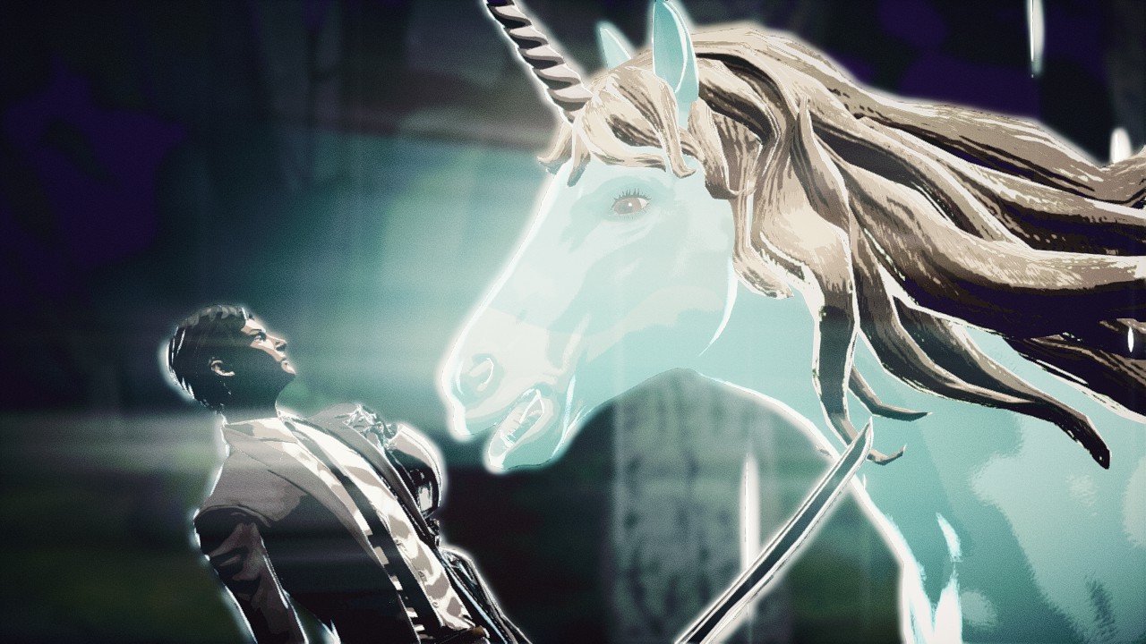
What is the final point I want to make? Well, that I am a fucking idiot that lets pretty colors dictate what games I finish and what I set aside. Also look at this unicorn from Killer is Dead
- Plk_Lesiak and 1P1A
-
 1
1
-
 1
1
2 Comments
Recommended Comments