
Leaderboard
Popular Content
Showing content with the highest reputation on 11/06/15 in Blog Entries
-
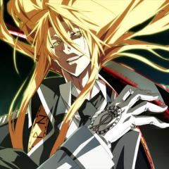
Kyuuketsu Hime no Libra
kingdomcome and 3 others reacted to Clephas for a blog entry
Mmm... first of all, this is by Onamatope, a company previously known only for its harem-ge from the Mecha-con series. The Mecha-con series fell somewhere into that thin area between a nukige and a moege, and it was actually pretty decent for something in that area of the VN universe. So, keeping that experience in mind, I went into this VN with a more open mind than some people probably would have. Fortunately, this VN wasn't a disappointment, precisely because I wasn't looking for it to be something out of this world. Ok, first... this is a chuunige, in the sense that it follows a format I think most people will be familiar with... this young guy is transformed and forced into a world where he has to fight to survive, with many pretty girls around him... sound familiar? It should. That right there is the basis for about ninety-percent of the entire 'gakuen battle' type chuunige sub-genre. In a few ways, this VN definitely borrows from Draculius, which I still think is the best non-superviolent vampire VN. There are a lot of differences between the two... but they share the commonality of allowing for a coexistence of slice-of-life and comedy with a more serious background story. I'll say it straight out though... there should have been an Iris path. I don't say this because I'm a lolicon (though the protagonist and his ancestors all were, apparently) - as I'm not - but because Iris was, at first, second and third glance, the most interesting female character in the VN. All the heroines had their moments... in fact, I was really, really surprised at the degree to which they managed to balance all the paths and gave the heroines an equal amount of story. Due to the fact that the first half of their paths are the same, you might think Aoi and Lycoris got a bit screwed over, but their events after the split are distinct enough - and long enough - that I can't really say either got screwed over by the scenario designer's choices. In that sense, this VN is something of a triumph of the art of scenario design, which was one of the areas in which Onamatope generally shined in its near-nukige Mecha-con series as well (one of the reasons my impressions of those games were positive). In terms of raw writing... the battle writing is actually some of the better non-Light and non-Propeller I've seen. That isn't to say it is first class, because it isn't. The protagonist is way too much of a hetare when it comes to dealing with his vampirism, and the fact that they chose to make all the heroines, sub-heroines, and the protagonist a bit 'baka' was a bit of an odd choice that had moments where it fell flat. The regular narrative writing is better than you generally see in a nakige (which generally get favored with the best moege-variant writers), and I can honestly say that the pacing didn't throw me off very often, though there were some shaky moments midway and early on. In terms of visuals... this VN definitely needed more combat CGs. I knew they would cut corners on this, as Onamatope is not a company that can afford the kind of budgets for visuals that monsters like Will and Light can. There was a bit too much reuse of the same tachie poses to simulate combat, and the best I can say is that they gave the protagonist a face and a tachie for once, which was a huge plus. ... unfortunately they didn't give him a voice. Perhaps one of the biggest no-nos with a modern chuunige is to fail to give the protagonist a voice. The simple reason for this? Because the protagonist in a chuunige is always intended to be an actual person, rather than a simple self-insert. As such, it is rather ridiculous to give into that particular convention when even using a random staff member would probably satisfy most people. Generally speaking, the music in this game is... generic-sounding in the sense that chuunige music can ever be generic-sounding. That means that the tunes are ones I suspect get sold to every company intending to make this type of VN, with a few twists and changes in the rhythm to make them sound different to the ears of someone who doesn't listen. On the positive side, there is no point in this VN where I felt like the music was misused, which is a far bigger flaw that simply reusing music tracks from other games. Overall, what can those of you looking forward to the localization look forward to? I'd say that if you want some slice-of-life with vampires merged with a low-level chuunige story, this will definitely be something to look forward to. On the other hand, fans of more serious chuunige will not be satisfied by this, as the game is just to light in the slice-of-life scenes and the protagonist is a bit too much of a near-hetare when it comes to the vampire issues.4 points -
The One Easy Tip for Good Type [VN Image Editing]
Helvetica Standard and one other reacted to Darbury for a blog entry
If you’re the image editor for a VN translation, you’ll probably spend at least half your time setting English type. Lots of it. (The other half will be spent laboriously retouching out all the Japanese text you’re about to replace.) Sounds simple on the surface, right? Any pixel monkey can copy/paste from a translation document. But there’s a lot more to good typesetting than just clicking with text tool and banging away on the keyboard. Just like good prose, there’s a certain rhythm to good type. A practiced designer will make numerous small adjustments along the way that allow the to reader glide effortlessly through whatever’s being said. Reading good type should be like driving on a well-paved road. And the one thing all good display type has in common: someone took the time to kern it. The Basics of Kerning I won’t go into a detailed discussion of kerning here — the terminology, the history, the fact that it sounds like something you’d have to pay an escort extra for. If you’re interested in that sort of thing, there are lots of sites out there for you to read. Better yet, buy yourself The Elements of Typographic Style, the best book about type you could ever hope to own. Call it an early Christmas present to yourself. For our purposes, it’s enough to say that kerning means to adjust the empty space between any two adjacent characters, either bringing them closer together or pushing them father apart. And why would you want to do that? Otherwise, you’ll have gaps and crashes in your type that’ll make things feel ever so slightly off. To illustrate, I browsed over to a free font site and downloaded a typeface at random. (There’s a very good reason I did this, rather than using some industry-standard font like Helvetica or Times Roman. I’ll get to that in a minute.) Downloading, downloading … done! Okay, let’s set some type. Here we have a few words set in Font X — name redacted to protect the innocent. At first glance, everything seems fine. But then you look closer and start noticing little things. Like what are these weird gaps between the first two letters of some words? Some are almost as wide as the full space between words. And hey, what about these letters over here that are more or less crashing into each other? That can’t be good, right? Nope. These are problems. They need to be fixed. Kerning Pairs The reason I picked a free font is because most professional typefaces (aka, “ones you pay a lot of money for”) are designed to avoid the majority of such issues. Once a typographer has crafted all the characters for a font, he or she will then spend countless hours specifying “kerning pairs” for it — basically, instructions on how close each letter should sit next to every other letter. (Here’s how close A should be to B, here’s how close A should be to b, etc.) While some letter pairings may look good at default spacing, others will need to pull tighter or push father out to look right. Professional fonts will often contain hundreds of these kerning pairs. It’s mind-numbing work that takes far more time than most amateur typographers are willing to put into a freebie font project. That work still needs to get done, however, but now it’s on your shoulders instead. And, since most fan translation projects use free fonts for budgetary reasons, odds are you’ll have a whole lot of mess to clean up. Congratulations! Thankfully, once you’ve learned how, it’s pretty easy stuff. I work in Photoshop, so I’ll be showing its kerning interface here. If you use another program, it likely has something similar. Here’s Photoshop’s character palette, with the kerning field highlighted: The "0" you see there means there’s no kerning currently being applied to the characters on either side of your text cursor. Make this number negative, and the two letters will start pulling closer together. Make it positive, and they’ll start pushing farther apart. (Photoshop measures this in units 1/1000 ems, but that’s bar trivia you don’t really need to remember. Just know that in most cases, you’ll be entering numbers in the range of -100 to +100.) You can see the results of some sample values below. In Photoshop, you also have the option of “Metrics” (apply whatever kerning pairs the typographer included in the font, if any) or “Optical” (let Photoshop guess what looks good, basically). Play around to get a feel for things, then advance your cursor through your type, letter pair by letter pair, and adjust this value until the two letters are the right distance apart. Rinse and repeat. And what’s the “right” distance? The one that looks right, of course. It’s a subjective thing, and this is where practice and design experience come into play. Like The Sands Through The Hourglass One of the first art directors I worked under offered me this analogy, which I’ve always rather liked: Imagine the negative space between letters as vases lined up in a row. They’re all different shapes, these vases, but you want each to be able to hold an equal amount of sand (or M&Ms or whatever). Kern until your vases all look like they could all hold the same amount. This is an imprecise rule, of course, and you’ll often want to make your “vases” bigger or smaller for visual effect, but it gives a beginner a good baseline approach. So let’s take that approach here. Let’s go through, fix all the obvious gaps and crashes we noted earlier, then make smaller adjustments to even out the text overall. (We call this giving the type an even “color.”) After some quick fiddling, we end up with something like this before and after: It’s subtle, but the "after" type just feels nicer overall. And if your text is a UI element that some poor reader will spend countless hours staring at, you want to make sure it’s as nice as you can manage. Because the longer you spend with something, the more obvious and annoying its flaws become. (Said every roommate ever.) The good news is you don’t need to do this everywhere. It’d be insanity to kern entire sentences or paragraphs of text, especially since the effect is barely perceptible at those point sizes. You only really need to worry about kerning display type — things like buttons, headlines, title screens, etc. If your type is over 16pt, it probably needs to be kerned. The good news is, as you learn the keyboard shortcuts for your particular application/platform, you’ll be able to breeze through a piece of type in a matter of seconds. In fact, a lot of designers find sitting down and kerning type to be mindlessly relaxing, like knitting or playing Minesweeper or making fun of the animations in Fallout 4. Mind Your Gaps So that’s kerning in a nutshell kernel. It’s the absolute easiest way to step up your type game, and it’s quick enough that there’s no reason not to do it. As a bonus, there’s a fun little online game out there to let you practice your kerning skills in hypothetical situations and compare them to a professional designer’s solution. It’s a fun way to kill some time at work while you boost your skills.2 points